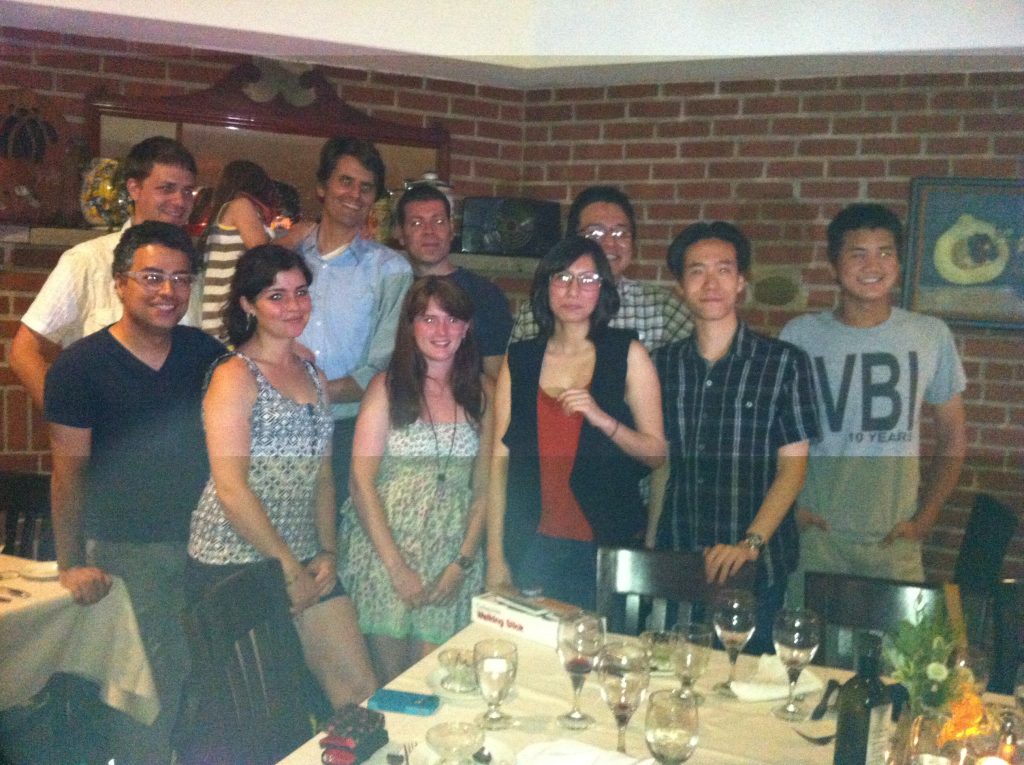
It’s been over a year since we finished work on the graphic novel Jerusalem! The book was recently released, and I was reminded that I have yet to document all the work that went into the creation of the epic 380 page story. Since this book was more than three times the length of a typical graphic novel, the publisher FirstSecond and Nick Bertozzi decided to hire a team of artists to help complete the tome. Originally brought on to letter, color, and help pencil the book, I ended up being the Art Director for the 18 month process.

What exactly is an Art Director for a graphic novel? Well, Nick and I decided that title was what best described my role streamlining the massive process involving twelve artists that helped pencil and ink the book in addition to the ten interns that helped scan, clean, and tone the artwork. The important goal was to not only manage the production but to make sure that the output of so many artists looked cohesive in the style that is unique to Nick Bertozzi.

Originally written as a screenplay, writer Boaz Yakin provided us with a PDF of the script. Film scripts and comics scripts are very similar but changes usually need to be made for page breaks and pacing. To do this, we converted the file to text and Nick went line by line and separated the dialog and descriptions into pages and panels, cutting or combining scenes that he thought would help clarify the story when viewed as sequential art rather than moving image.
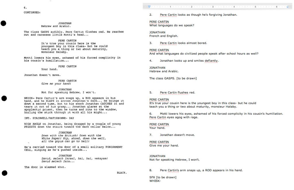
Boaz gave his impressions and notes at each step of the way. Not only is the story based on his father’s family in Israel, he also has a well established eye for storytelling that was honed over the years by writing and directing movies such as Remember the Titans, Fresh, and Safe.

After a script was solidified, Nick began rough thumbnail layouts. He decided to base the book on three-tiered double page spreads. We mocked up a template that fit the final dimensions of the book and shrunk it down so that it could be printed on a landscape 8.5″x11″ sheet of paper.
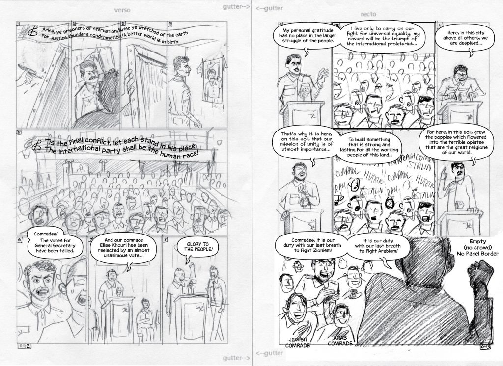
We then scanned these layouts and opened them up in Adobe Illustrator to do the lettering. Typically, lettering a comic is the final phase of a book, but since there would be so many artists working concurrently, we wanted to establish the location and size of the dialog balloons so that Nick would not have to resize (or redraw) panels that might not fit. This also gave Boaz a chance to change some wording that might have affected the drawing.
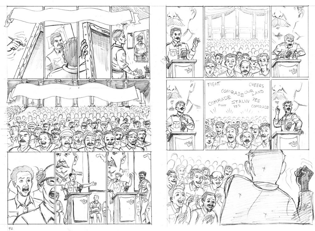
We then resized each lettered rough to a full 20.8″ x 14.75″ and emailed the file to the pencilling artist. They would then print out the lettered rough and use a light box to do their penciled pages. After the penciler finished a batch of pages, they would bring the pages to our studio in Long Island City where we would scan them into Photoshop and put them back into Illustrator to recheck the lettering.
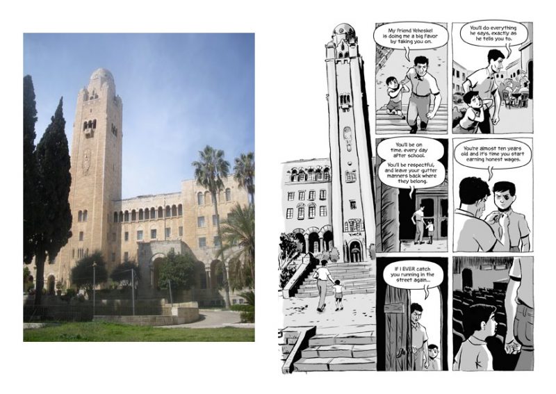
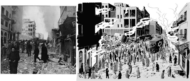
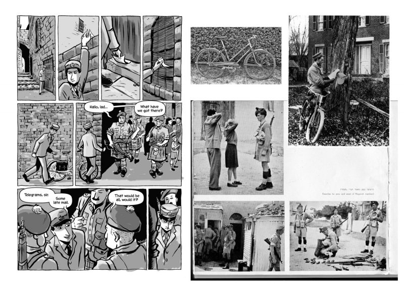
Historical accuracy was important and in order to get the proper look and feel of a mid-twentieth century Jerusalem, lots of reference photos were used for penciling. Boaz provided many photos and a book published in 1950 about the creation of Israel. Artist Lydia Roberts provided some reference for the soldiers’ uniforms, military vehicles, and weapons. Amos Turner, a librarian at the School of Visual Arts also helped with research.
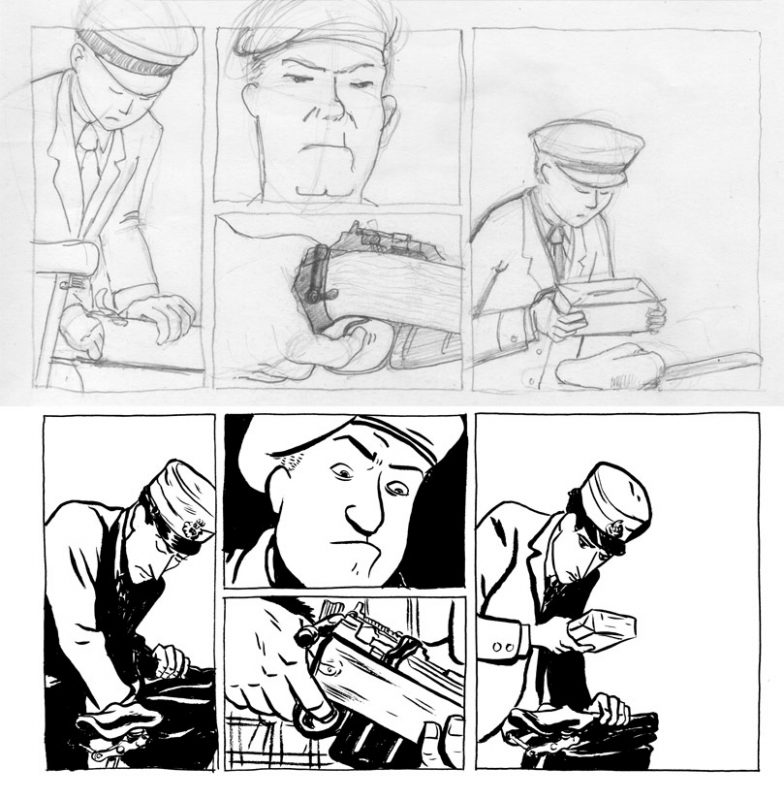
Sometimes Nick would redraw sections of the pencils to make the various pages cohesive. Most often this would be the faces and hands of the characters. Many artists (myself included) had difficulty emulating Nick’s art style and the page would have to be redrawn. As we got further into the book, we found it was faster for Nick to draw more detailed rough layouts which would be printed out in blue line and directly inked over. Some of the more difficult pages with explosions and tanks were still penciled by a separate artist, but a bulk of the last 250 pages were inked directly on top of roughs.
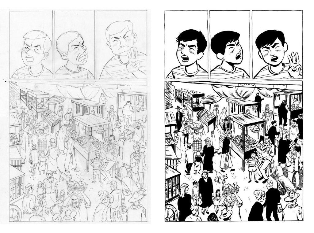
For the ink process, Nick would ink the heads, hands, entire characters, or entire pages depending on how much time he had. He would then pass the pages off to another inker who would ink the remainder of the page. These pages were then once again scanned in and cleaned up in Photoshop.
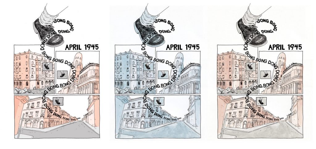
The next step was coloring. The printing budget allowed for two colors which meant black and one other color. I colored the first 20 pages which allowed us to experiment with different hues and styles. At one point, I was going to ink wash the entire book but 380 extra pages of high quality paper wouldn’t have been economical. Therefore, we had many great interns flat color the rest of the book which Nick then fine tuned into three shades which could later be changed to whichever hue we chose. We tried sepia to reflect the time period, peach-roses to reflect the coloring of the Jerusalem streets, and blue to reflect the mood.
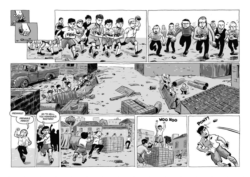
In the end, everyone decided that keeping it gray tones looked the best and saved money on printing which could be put into having a hardcover.

To help add context to the epic story, we added a map of Israel and a family tree to the front of the book. After many revisions here and there, the book was finished. All that was left was a cover which eventually was drawn up by Erik Buckham.

We heavily utilized Google software throughout this entire experience. We used image searches for historical reference, Google docs for script sharing and status spreadsheets, and Picasa for sharing layouts with pencilers. This all allowed 15+ team members to work remotely and concurrently. And best of all the price fit the budget — free!
